Digital publishing guide
On this page:
- Introduction from Richard Kramer, CEO
- Why have we created this guide?
- Who engages with our digital content?
- Digital publishing guide
- Creating and publishing content for Sense websites
- Creating and publishing video and audio content
- Creating content for social media
- For help creating digital content
Introduction from Richard Kramer, CEO
This Digital Publishing Guide has been created to ensure that Sense leads the way when it comes to creating inclusive and accessible content. It will provide you with the guidance you need to create with confidence. Our goal is to be truly inclusive and accessible, to go over and above the minimum accessibility requirements required by law.
Our website and the content we create for other digital channels must be fully accessible, including to those who are blind, colour-blind or visually or cognitively impaired. This will help us in our goal of removing barriers to information for the people we support, and it will increase our ability to reach the widest possible audience. This all supports our goal of supporting ten times more people with complex disabilities by 2026.
I encourage everyone to take the time to read this Digital Publishing Guide and to fully embrace its principles for all content creation, not just digital content.
Richard Kramer
Why have we created this guide?
Our digital content should be clear, useful and easy to understand. It should be as accessible as possible, so no one is excluded from accessing our content. And it should be created in a way that makes it easy to find on search engines. This means we will support more people and engage with new supporters.
“The single most important thing to understand is that people use websites in very different ways. Accessibility doesn’t just mean disabled people using special equipment.”
Mel Pedley, digital accessibility expert
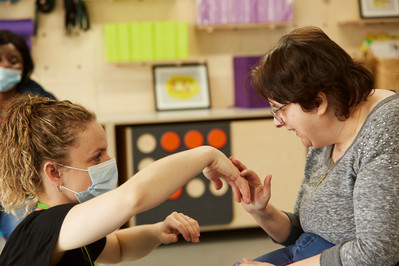
Who engages with our digital content?
There’s a wide range of people who visit our website and social media, including:
- People we support, and people we might support in future.
- The parents, loved ones and carers of disabled people.
- Fundraisers, campaigners, donors and funding partners.
- Current and prospective employees, volunteers and trustees.
- Other stakeholders, such as professionals from local authorities, teachers and more.
Remember, any of the users listed above could be disabled or have accessibility needs.
Some people who engage with our website or social media will know us already, others will be new to Sense. They may be unfamiliar with what we do, who we support and how we work. This is likely to be true of the people we’re most keen to reach – people who are deafblind and those with complex disabilities, and their parents, families and carers. We want these users to understand what Sense does without feeling overwhelmed by convoluted language or jargon.
User personas
Meet some of the people who are engaging with our content:
Marcus, aged 23, is a new dad. His six-week-old baby is deafblind and he’s feeling overwhelmed. What impact will this have on the rest of the family? How will he be able to support his daughter to navigate the world around her?
Candice, aged 13, enjoys school and catching up with friends. She has cognitive disabilities and wants to be more adventurous and independent. She’s interested in finding out what activities she can get involved with through Sense.
Janet, aged 48, is the CEO of a regional accountancy firm. She was injured in a car accident four years ago and now uses speech-to-text software. She’s interested in forming a partnership with a charity supporting disabled people and wants to find out more about Sense.
Mohammed, aged 31, works in customer service and is looking to move out of the corporate sector. He’s visually impaired and is searching for roles within purpose-led organisations.
Digital publishing guide
This guide is for anyone creating digital content for Sense, or content that will be published on our website and/or on our digital channels, including:
- All Sense websites.
- All our social media like Facebook and Twitter.
Creating and publishing content for Sense websites
All content on the Sense website should be published as a web page. Avoid using downloadable documents or files to publish any information or content. Remember, the web is accessible by default.
Downloadable documents, especially PDFs, can be difficult for people to access, find and read. They:
- Create problems for people using assistive technology such as screen readers.
- Can be particularly challenging for people with visual impairments.
- Are harder for search engines, such as Google, to read.
- Are also difficult to download and navigate using a mobile phone – more than 60% of people visiting our website are using a mobile.
For these reasons, we don’t use downloadable documents as the primary method to publish information on Sense websites.
The only exceptions to this are when we have a legal obligation to publish information in a certain format, such as our annual report and accounts, Ofsted reports or for certain policy documents such as our safeguarding policy.
Writing web content
Creating accessible content is more than just making sure it can be interpreted by a screen reader. It’s also important to use plain English. This will make it easy to read and understand for people with different levels of literacy.
These are some of the key things to remember:
- Keep sentences no longer than 15-20 words.
- Use the active voice. (For example, instead of “the matter will be considered”, write “we will consider the matter”.)
- Refer to the reader as “you”.
- Don’t use jargon or unnecessarily formal words.
- Don’t use a long word where you could use a short one. (For example, write “needs” instead of “requires”, or “uses” instead of “utilises”, or “law” instead of “legislation”.)
- Don’t use abbreviations or acronyms, and don’t write in all capital letters. The only exceptions to this are abbreviations that are well known such as BBC or NHS or when the abbreviation is more commonly used than the full word such as CHARGE syndrome or Covid.
- Don’t describe colours, shapes or any visual cues to provide instructions. (For example, “click the square button” requires the user to be able to see, and won’t be picked up by a screen reader.)
- Avoid italics.
- Don’t use footnotes. Use in-line explanations instead.
- Be punchy and straight to the point.
A good way to test if your copy is clear is to try reading it aloud. Does it sound like something you would naturally say?
Before starting to write you should read the Sense Identity Guidelines for information on our tone of voice and language. You should also refer to our terminology guide, Words we use.
Copy structure
A good web page breaks information up in a digestible way. It should have:
- Subheadings.
- Short sentences (15-20 words) and paragraphs.
- Bullet points and/or numbered lists.
- A logical reading order.
For example:
Poor copy structure
Writer’s block is a condition which affects many well-known authors and poets. It’s incredibly frustrating and can be very inconvenient, striking out of the blue and at any time. You might also find it returning again and again. Rather than persisting if you find yourself struggling to write, the best thing to do is take another break. When writer’s block happens to you, do not despair as there are steps you can take. These include taking a break from your screen and then when returning creating a bulleted list of the main messages or points you want to cover. You can then draft an outline plan of the content structure using the bullets before you start writing. At this point you should find that content will flow more easily. If there is one section that is going particularly well you should focus on that one and not feel that you must start with the introduction. If your writer’s block returns…
Good copy structure
Overcoming writer’s block
Writer’s block is a condition which affects many well-known authors and poets. It’s incredibly frustrating and can strike at any time.
If it happens to you, here are some tips to try:
- Take a break from your screen.
- When you’ve had a break, write a bullet-point list of the main messages or points you want to cover.
- Draft an outline plan of the content structure using the bullets from step two.
- Now start writing. Write whichever paragraph flows most easily. You don’t need to start by writing the introductory paragraph.
- If you find yourself struggling to write, take another break.
Date and time formats
Dates and times must be given clearly, and in a consistent format.
A screen reader would read SAT 05/09, 09:10 as “S A T zero five zero nine nine ten”. That’s why it’s important to write it as Saturday 5 September 9.10am.
Correct date and time formats
Dates
- Use Day Month Year – Wednesday 4 August 2017.
- Don’t use commas.
- Write 4 August not 4th August.
Times
- Use the 12-hour clock.
- Put a full stop, not a colon, between the numbers – 9.30am not 9:30am.
- Don’t use spaces, capitals or full stops. Only use a full stop between numbers.
Please note people with cognitive disabilities can find inconsistencies in how dates are displayed difficult to process. If you have space, it’s a good idea to say whether the time is in the “morning”, “afternoon” or “evening”.
Headings and titles
Headings make it easier for both people and screen readers to scan copy to find relevant information. Your main heading and the subheadings you use in your copy should be clear and use the active voice. This compels the reader to keep reading.
Subheadings should be used to break up your copy into sections. These should clearly tell the reader what information they will learn from each section.
For example:
Poor heading: Accessibility and inclusion in the local community
Good heading: 5 top tips to make your community more accessible
Good heading: How to make your community accessible for disabled people
All your subheadings should follow a similar format. So, if the first subheading says, “Make space for wheelchair users”, your other subheadings should also be an active instruction. They should logically follow on from each other.
You should write all headings in sentence case.
Search engine optimisation (SEO)
It’s important to write SEO-friendly web copy. This will help our content reach more people.
Here are some top tips:
- Think about who needs to read this page. What information will they want to see first? Put the most useful information at the top.
- Write clear, active headings without unnecessary descriptive language.
- Start every paragraph with the most important sentence. Then, explain it.
- If you’re uploading your content to the CMS, make sure you fill out the meta title and description.
- Include links to other relevant content on our website.
- Use keywords that your target audience is likely to search for in your copy and headings.
- But avoid keyword-stuffing: write naturally, using keywords where it makes sense to use them.
Need help with writing the metadata, or figuring out which keywords to use in your copy? Get in touch with the digital team. [email protected]
Images, graphs and tables
Alt text
Alt text explains what’s happening in an image and how it relates to the surrounding content. It’s read aloud to users by screen-reader software, and it’s indexed by search engines.
Tips for writing good alt text
- Be specific and succinct – say what you see and use 130 characters or fewer.
- There is no need to start with “image of…” or “graph showing…”
- Think how you’d briefly describe the item over the phone.
- Adding keywords can help with SEO, but only use keywords if they’re directly relevant to the image – and don’t over-use them!
- Include any text that’s shown in the image.
- Don’t repeat yourself – if there’s a caption with the image, graph or infographic, you don’t need alt text too. (But it might be useful to follow these tips when writing your caption!)
- Alt text isn’t needed for ‘decorative’ images, in that case leave the alt text field blank.
Alt text examples


Images
Don’t use images containing text. This is because:
- The text size can’t be increased.
- The text can’t be read by screen readers.
- Magnifiers cause the text in images to become pixelated and unreadable.
The only exceptions to this are logos which often contain text.
All images, apart from decorative images, should have alt text. This describes the image and the information it conveys for people who use screen readers.
Don’t use animated GIFs on the web or in emails. They’re not easy to start and stop, which can cause issues for people with motion sensitivity. Use a static image in emails, or you might be able to use an embedded video on a webpage.
Tables
- Don’t use tables. They can be confusing for screen reader users.
- There may be some exceptions to this, for example, if you’re presenting statistics. Contact the digital team for more information.
Graphs, diagrams and infographics
- Include explanatory text or alt text in the copy alongside images, graphs and charts.
- Use the SVG file format for presenting charts and data visualisations. This will mean text is readable and the images size can be increased.
- Include explanatory text or alt text in the copy alongside images, graphs and charts.
- Use the SVG file format for presenting charts and data visualisations. This will mean text is readable and the images size can be increased.
For example
Ages of people with complex disabilities in the UK
Our estimates show that people with complex disabilities in the UK are predominantly adults, aged 18 and over. If we look at the break down by age group, we can see that 42% are between 18-64 (approximately 667,000 people) and 38% are over 65 (approximately 606,000 people). For the younger age group, our analysis indicates that 20% of people are between 0-17 years old (approximately 318,000 people).
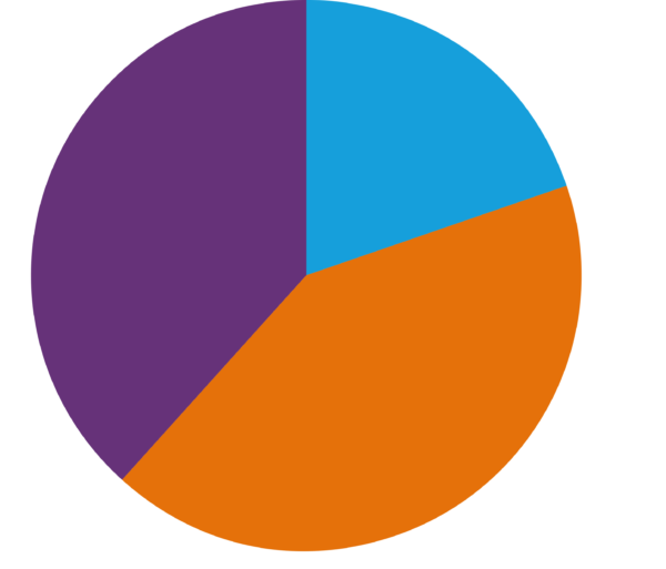
| Age group | Number of people |
 0-17 years 0-17 years | 318,339 |
 18-64 years 18-64 years | 667,417 |
 Over 65 years Over 65 years | 606,155 |
Forms
Forms should always be created as web forms.
Forms provided as downloads in Word or PDF add an extra, unnecessary step for the user, and can be more difficult for people using screen readers, magnifiers or mobile phones.
Please contact the digital team for help. [email protected]
Adding links to external content and email
To other websites
When adding a link to a different page or website don’t use shortcuts such as “click here” or “read more”. This is because people who rely on screen readers often browse a list of links to get an idea of the content available.
Links should have a clear, meaningful description of what is being linked to. For example, “Book a Sense Sport workshop.”
This makes URLs much easier to understand, which will help those users with screen readers decide whether to click through.
For example
URLs should never be used in full. Screen readers and text-to-speech programmes read a URL out one letter at a time. Imagine the time it would take to read out a URL like this one: https://www.frontiersin.org/articles/10.3389/frai.2020.571955/full
Correct
Sense welcomes contributions to support our work. Please visit our website’s donate page where you can make a donation.
For more information visit the Care Quality Commission website.
Incorrect
We welcome donations to support the work of Sense.
Click here to visit the Care Quality Commission.
Visit https://www.cqc.org.uk/
To email addresses
When providing an email address for people to contact, use the full email address as the link text. Otherwise it won’t be clear that the link is an email address.
For example
Correct
For more information please email [email protected]
Incorrect
For more information please contact Customer Service
Creating and publishing video and audio content
You should plan to create accessible video and audio content from the start of your project. The best way to do this is to include people with accessibility needs and lived experience of disabilities in the process.
Below are some of the key things to consider. You should also visit the Web Accessibility Initiative website for detailed information on creating accessible video and audio content.
Descriptive text
- Integrate descriptions into scripts.
For example: instead of someone saying, “As you can see on this chart…” they would say, “The chart shows…” This should also include speaker names, titles, and e-mail addresses being read out, not just appearing on screen.
Subtitles
- Provide subtitles so that people who are Deaf and hard of hearing get a text version of the speech and non-speech audio information needed to understand the content. Subtitles should be burnt in, and consideration given to frame position when footage is shot to allow for the subtitles to be added on the bottom quarter of the frame.
Transcripts
- Provide a transcript – a text version of the speech and non-speech audio information. Ideally, make it a descriptive transcript that also includes text description of the visual information. Descriptive transcripts are required to provide video content to people who are both Deaf and blind.
Sign language
- Provide sign language when your audience needs it, so that Deaf people whose native language is sign get the content in their native language.
- Include BSL if your content is being made for an audience for whom it is their first language.
Selection of media players
- Not all media players are not accessible to people with disabilities. Always use a player developed specifically for accessibility.
Creating content for social media
Posting on social media
Social media is fun, and your posts should express your personality. But there are a few key things to keep in mind to make sure everyone feels included and can enjoy your content.
- As with website content, any images posted on social media should have alt text. This guide to alt text from Accessible Social shows how to add it on different platforms.
- When writing hashtags, capitalise the first letter of each word. This is called CamelCase. It helps people and screen readers alike to read hashtags more easily.
- Don’t use emojis too much. One per post is fine. Try to use it at the beginning or end of your post, or at least, don’t use it in the middle of a sentence. Don’t repeat emojis, and leave them at their default setting instead of changing the colour or skin tone.
- Don’t use alternative characters or cases. These are alternative typefaces that are copied and pasted into social media posts. Many assistive devices can’t read these characters.
- Don’t add unnecessary formatting to your post, like centre-aligning the text or separating it into columns.
- Use GIFs sparingly. These should only be used when they significantly add to your post. And remember the alt text!
Writing copy for social media
- Just like website copy, social media copy should be written in plain English. Ideally, it should be even simpler and more concise. Aim for a reading age of around nine years old.
- Be conversational and informal. Read your posts aloud. Does it sound like something you would naturally say to a friend or colleague?
- Get your point across quickly. Don’t bury the lede, as people often skim-read on social media.
- Don’t write anything in all capital letters, or use capital letters for unnecessary emphasis.
- Use punctuation accurately. Don’t use repeat punctuation, or use multiple items of punctuation together (like a question mark and an exclamation mark).
For help creating digital content
If you have any questions about applying the guidelines, creating content or want to provide feedback, please do not hesitate to contact:
Please contact the digital team for assistance: [email protected]